
Ever wondered at what exact point your business flips from losing money to making it? A break-even chart is a powerful visual that does just that, showing you precisely where your total revenue lines up perfectly with your total costs.
It’s the roadmap that shows how many units you have to sell or how much cash you need to bring in to cover every single expense.
Your Startup's Financial Compass

Forget wading through dense, complicated financial reports for a second. Picture a single, clean graph that tells you exactly when your startup stops burning through cash and actually starts turning a profit. That's the real magic of a break-even chart.
This simple graph is a founder's best friend—a genuine reality check. It cuts through the noise of financial forecasting and gives you a straight-up look at your business model. By plotting your costs against your revenue, it makes the relationship between what you spend and what you earn crystal clear.
To get the most out of it, you need to get to grips with the basics of What Is Break Even Analysis. This isn't just some textbook exercise; it's a living guide for making smarter calls on everything from your pricing strategy to your next big expansion move.
Before we dive into building one, let’s quickly break down the essential pieces you'll be working with.
Key Elements of a Break-Even Chart at a Glance
| Component | What It Represents | Why It's Crucial for Your Startup |
|---|---|---|
| Fixed Costs | Expenses that stay the same no matter how much you sell (e.g., rent, salaries, insurance). | This is your baseline burn rate. You need to cover this amount just to keep the lights on. |
| Variable Costs | Costs that increase directly with each sale (e.g., raw materials, transaction fees, shipping). | Understanding this helps you calculate how much profit you make on each individual sale. |
| Total Costs | The sum of your fixed and variable costs. This line shows your total cash outflow. | This line reveals how your expenses grow as your business scales. |
| Total Revenue | The total amount of money you bring in from sales (Price per Unit x Units Sold). | This is the top line. The goal is to get this line above your Total Costs line as quickly as possible. |
Understanding these four components is the foundation for creating a chart that gives you real, actionable insights into your business's health.
A Practical Tool for Growth
This chart is an absolute must-have for early-stage companies trying to find their footing in unpredictable markets. It helps you tackle the tough questions that probably keep you up at night:
- How many sales do we really need just to keep going?
- Can we actually afford to bring on that new developer right now?
- What would happen to our profits if we decided to drop our prices?
This visual approach makes financial data easy to digest, even if you don't have a background in accounting. It turns abstract numbers into a clear roadmap, helping you guide your company with a lot more confidence. Here in Ireland, this kind of analysis is a game-changer. Software firms that use break-even analysis have seen a 22% reduction in their time to profitability, with a typical Dublin-based AI firm hitting its break-even point around €1.28 million in annual sales.
A break-even chart does more than just show you the numbers. By visualising the journey to profitability, it gives you the clarity you need to make smart, strategic moves and turn big goals into steps you can actually take.
The Three Core Lines of Your Chart
Think of your break-even chart as a simple story about your startup's finances. It has three main characters, each represented by a line on the graph: your fixed costs, your total costs, and your total revenue. Getting to know each one is the key to understanding the plot.
The Foundation: Your Fixed Costs
First up, you have the Fixed Costs line. This one's easy – it’s a perfectly flat, horizontal line. Why? Because these are the bills you have to pay every single month, no matter what. It doesn't matter if you sell one unit or one thousand; these costs don't budge.
These are the non-negotiables, the baseline burn rate that keeps the business running. For a typical tech startup here in Ireland, that usually means things like:
- Rent for your office space in Dublin.
- Salaries for your core team.
- Annual subscriptions for essential software (think Slack, a CRM, or project management tools).
This line is your starting block. It’s the financial hurdle you have to leap over just to open your doors each day.
The Reality of Scaling: Your Total Costs
Next, we have the Total Costs line. This one is more dynamic. It actually starts from the same point on the y-axis as your fixed costs line, but then it slopes upwards. It’s telling a different story – the story of growth.
This line is the sum of your fixed costs plus your Variable Costs. Variable costs are the expenses that creep up directly in line with your sales. For a SaaS business, for instance, the more you sell, the more you'll likely spend on:
- Cloud hosting and server usage.
- Payment processing fees on each transaction.
- Per-user licences for customer support software.
The Total Costs line shows the true cost of scaling up. The steepness of this line is a dead giveaway for how much it really costs you to win and support each new customer.
The Goal: Your Total Revenue
Finally, there’s the star of the show: the Total Revenue line. This line starts at zero (because with zero sales, you have zero revenue) and climbs steadily upwards with every sale you make. It’s the pure, unfiltered cash coming into the business.
For a tech company, this is the money you're bringing in from subscriptions, one-off purchases, or professional services. It’s the tangible result of all your team's hard work.
The magic moment arrives when the Total Revenue line finally crosses over the Total Costs line. That intersection is your break-even point. It's the precise moment your startup officially stops losing money and starts turning a profit. Every sale you make to the right of that point is pure profit.
How to Build Your First Break-Even Chart
Right, let's get our hands dirty and move from theory to action. Building your first break-even chart is a lot more straightforward than you might think, and you definitely don't need any fancy, expensive software to get it done. The tools you're probably already using every day, like Google Sheets or Microsoft Excel, are more than up to the task.
The whole process is really about gathering a few key numbers and plugging them into a simple structure. Doing this turns a jumble of financial data into a clear, visual story about your business’s journey to profitability.
Let's walk through it together, step-by-step.
This visual gives you a quick look at the core components we'll be plotting: your fixed costs, your variable costs, and that all-important revenue line.
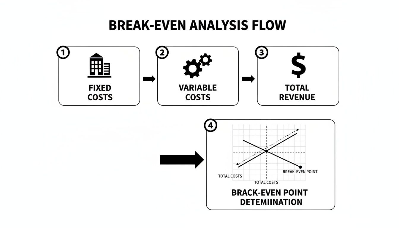
As you can see, it all starts with that solid foundation of fixed costs. Then, we layer on the variable costs that grow with your sales, and finally, we map your revenue to find that magic intersection point.
Step 1: Gather Your Financial Data
Before you can build anything, you need your raw materials. The first job is to pull together all the necessary figures. For a chart that’s actually useful, you'll need three key pieces of information:
- Fixed Costs: Get a grand total of all your monthly expenses that stay the same no matter how much you sell. Think rent, salaries, insurance, and those software subscriptions. You're aiming for a single, total monthly figure here.
- Variable Cost Per Unit: This is the direct cost tied to producing one unit of your product or serving one customer. For a software company, this might include things like server costs, payment processing fees, and customer support time per subscriber.
- Price Per Unit: Nice and simple—this is what you charge a customer for one unit of your product or one month of your service.
Getting these numbers organised and accurate is easily the most important part of the whole exercise. If you’re not already, using some of the best accounting and bookkeeping software can be a lifesaver, making sure your data is always correct and easy to find.
Step 2: Set Up Your Spreadsheet
Now, fire up a new spreadsheet in Google Sheets or Excel. We're going to create a simple table to hold your data and run the calculations. Think of this as the engine that will power your chart.
Start by creating columns for a range of sales volumes—say, from 0 units up to a number well past where you think you'll break even. Then add columns for Fixed Costs, Variable Costs, Total Costs, and Total Revenue.
Your goal is to create a data table that projects your costs and revenue at different levels of sales. This data is what you’ll actually plot on the graph.
Before we fill that out, we need to figure out your Contribution Margin Per Unit. This is a crucial number. It tells you exactly how much profit each sale "contributes" towards paying off your fixed costs. The formula is beautifully simple:
Contribution Margin Per Unit = Price Per Unit – Variable Cost Per Unit
Step 3: Calculate Your Break-Even Point
With your contribution margin sorted, you can now pinpoint your break-even point in two very useful ways: in units sold and in total revenue.
Break-Even Point in Units: This tells you exactly how many items you need to sell to cover every last penny of your costs. Here’s the formula:
Break-Even Point (Units) = Total Fixed Costs / Contribution Margin Per UnitBreak-Even Point in Revenue: This tells you the total sales figure you need to hit to get out of the red. The formula for this is:
Break-Even Point (Revenue) = Break-Even Point (Units) x Price Per Unit
Once you have these two figures, you've officially done the heavy lifting. You have the core data for your break-even chart. The final, and most satisfying, step is to plot all this visually to really bring the insights to life.
How to Read Your Chart for Strategic Insights
So, you've put in the effort and mapped out your break-even chart. That's a great first step, but a graph full of lines is pretty useless if you can't translate it into what it actually means for your business. This is where your chart stops being a simple academic exercise and becomes a genuine strategic tool to help you make smarter decisions.
The most obvious starting point is the break-even point itself—that magic spot where your total revenue line dramatically crosses your total cost line. Everything to the left of this intersection is your loss zone. This is where you're spending more than you're making, essentially burning through cash. Everything to the right? That's the good stuff: your profit zone, where every sale you make starts padding your bottom line.
Pinpointing Your Profit and Loss Zones
Getting a handle on these zones is fundamental. It's not just about hitting profitability; it's about understanding exactly how deep in the red you are at the start and just how far you need to push to get into the black. This visual clarity makes tough decisions a lot less intimidating. Wondering if you can afford to bring on a new marketing specialist? Your chart will show you precisely how many more sales you'll need to make to cover their salary and still come out ahead.
This isn't just theory, either. Data from Israel’s vibrant tech scene showed that pre-IPO firms using this kind of analysis achieved 28% higher valuations and typically hit profitability around the $1.8 million revenue mark. Closer to home, Irish stats suggest this type of forecasting is about 77% accurate, which is a huge leg up when you consider the global startup failure rates. You can dig deeper into these living conditions and economic indicators on ec.europa.eu.
The break-even point isn't just a number; it's a target. It gives your entire team a clear, measurable goal to rally around, aligning sales, marketing, and operations on one simple mission: get to the right side of that line.
Understanding Your Margin of Safety
Beyond just hitting your break-even number, your chart reveals something equally important: your margin of safety. Think of this as the gap between your current sales level and your break-even point. It's your financial buffer, telling you exactly how much your sales could dip before you start losing money.
A wide margin of safety means your business has resilience. You can absorb a slow month, handle an unexpected bill, or even ride out a competitor's aggressive new campaign without immediately plunging into the red. A narrow margin, on the other hand, is a serious warning sign. It tells you that even a small stumble could put your business in a very risky spot.
This insight is crucial for long-term financial health. Once you know where you stand, you can start building effective strategies for positive cash flow to protect and expand that safety margin. Having a clear view of this buffer is non-negotiable, and our guide on protecting and understanding your cash flow can give you some great ideas for building that resilience. At the end of the day, your break-even chart doesn't just show you where you are—it shows you how much breathing room you have.
Using Your Chart for Advanced Scenario Planning

A static break-even chart is useful, but a dynamic one is a game-changer. Your business isn't set in stone, so your financial models shouldn't be either. This is where sensitivity analysis—or 'what-if' planning—turns your chart from a simple snapshot into a seriously powerful forecasting tool.
Think of it as a financial flight simulator for your startup. Instead of just reacting when the market shifts, you can get ahead of it by modelling those changes now. This lets you stress-test your business plan against all sorts of potential futures, giving you the confidence to adapt and pivot when you need to.
Modelling Different Business Scenarios
The real magic of a break-even chart happens when you start playing with the numbers. By creating a few different versions of your chart, you can see how even small tweaks can send ripples through your entire financial model. It’s all about preparing for both the good and the bad.
Try running a few common 'what-if' scenarios to see what I mean:
- A Price Increase: What happens to your break-even point if you bump your prices up by 10%? You’d need to sell fewer units to turn a profit, sure, but how would that impact customer demand?
- Rising Supplier Costs: Imagine a key supplier raises their prices, pushing your variable costs up. How many more sales do you suddenly need just to stay afloat?
- Investing in Growth: Thinking of hiring a new developer? You can add their salary to your fixed costs to see exactly how that investment pushes your profitability target further down the road.
By modelling these scenarios, you're not just guessing; you're making decisions backed by data. This kind of robust thinking is exactly what potential investors want to see—it proves you’ve thought through the risks and opportunities that lie ahead.
Turning Scenarios into Strategy
Running these what-if scenarios helps you build a much more resilient business. In Ireland’s tech scene, this forward-looking approach has had a massive impact. Enterprise Ireland tracked 210 AI ventures and found that those who mastered dynamic financial modelling broke even an average of 14 months faster and raised an impressive €450 million.
This kind of strategic modelling helps you define your most critical financial targets and understand the levers you can pull. To take it a step further, you can learn more about what are KPIs and how to set them effectively for your team.
What’s more, 71% of those firms adjusted their models to account for significant energy price hikes—a smart move that helped them avoid the fate of 19% of similar businesses that were forced to close. These numbers show how a break-even chart can evolve from a simple calculation into a vital dashboard for navigating the inevitable uncertainty of running a business.
Common Break-Even Analysis Mistakes to Avoid
A break-even chart looks straightforward, right? Plug in a few numbers, draw a few lines, and you're done. But this is where a lot of founders get into trouble. Simple mistakes can quickly multiply, giving you a completely skewed view of your business and leading to some truly questionable decisions.
Knowing where the common traps lie is half the battle. Let's walk through them.
One of the biggest culprits is getting your costs mixed up. The line between a fixed and variable cost can be surprisingly blurry. For instance, you might think a salary is a classic fixed cost, but what if that person gets a commission on sales? Suddenly, a chunk of their pay is variable. If you don't factor that in, your entire calculation will be off from the get-go.
Another classic mistake? Rose-tinted glasses. We all want to believe our sales will go through the roof, but building your analysis on wildly optimistic projections is just setting yourself up for a nasty surprise. Your chart is only ever as good as the data you put into it. Rubbish in, rubbish out.
Treating the Chart as a One-Off Task
The single most damaging mistake I see is when founders treat their break-even chart as a "set it and forget it" document. They create one during their initial planning phase, feel proud of it, and then tuck it away in a folder, never to be seen again.
Your business isn't static. Your costs change, you adjust your pricing, and your sales ebb and flow. A chart based on data from six months ago is essentially a historical artefact, not a useful tool for making decisions today.
Think of your break-even chart as a living dashboard, not a framed picture. It needs to be updated quarterly, at the very least, or anytime something significant changes in your business.
This is the only way to keep it relevant and genuinely helpful for steering the ship.
Other Critical Errors to Watch For
Beyond those big ones, a few other sneaky errors can trip you up. Keep an eye out for these:
- Ignoring Price Cannibalisation: So, you're launching a new, cheaper product? Great. But have you thought about how many customers will switch from your more expensive, higher-margin product to the new one? If you don't account for this, you're not seeing the full picture.
- Forgetting Semi-Variable Costs: Not everything fits neatly into a "fixed" or "variable" box. Think about your electricity bill—it probably has a fixed daily charge, plus a variable amount based on how much you actually use. These nuances matter.
- Using It for the Wrong Scenarios: A basic break-even analysis is perfect for a single product. But if you're selling multiple products with different prices and profit margins, a simple chart won't cut it. You'll need a more sophisticated, weighted-average approach to get a truly accurate break-even point for the whole business.
Common Questions About Break-Even Analysis
Even after you've built your first break-even chart, a few questions always seem to come up. Let's tackle some of the most common ones we hear from founders.
How Often Should I Update My Chart?
Think of your break-even chart as a living, breathing part of your business plan, not a "set it and forget it" exercise. For an early-stage startup, things change fast.
A good rule of thumb is to revisit it at least quarterly. But more importantly, you should update it any time something significant happens—like you land a new funding round, change your pricing, or bring on a few new team members. Keeping it current ensures it's a real tool for making decisions today, not just a snapshot of where you were six months ago.
Can a Break-Even Chart Work for a SaaS Company?
Absolutely. It's actually a perfect fit for a Software-as-a-Service (SaaS) business. You just need to tweak how you think about "units". Instead of widgets, your unit is a subscriber.
The model maps out perfectly:
- Fixed Costs: This is all your consistent, predictable stuff—team salaries, rent (if you have an office), and your core software stack.
- Variable Costs: These are the costs that creep up as you get more customers. Think server costs from Amazon Web Services, payment processing fees from Stripe, or maybe even data charges.
The chart becomes a powerful way to see exactly how many subscribers you need to hit before you're in the black.
For a pre-profitability startup, a break-even chart is non-negotiable. It’s more than a goalpost; it’s your roadmap for managing cash burn and understanding your runway.
It's the clearest way to show investors you've got a handle on your numbers. You're not just guessing; you can point to the chart and say, "This is exactly how many customers we need to become profitable." It proves you understand the mechanics of your own business.
You May Also Like
Discover more from Scott Dylan
Subscribe to get the latest posts sent to your email.